Raj writes in his 16th xdrive photo lesson that contrast, a deviation from the brightest parts of the image to the darkest, is often overlooked during the digital darkroom process. As I read his explanation about low contrast images, it brought to mind those long exposure landscape images that are composed of a single tree or those low contrast images of trees within mist or fog. Dreamy.
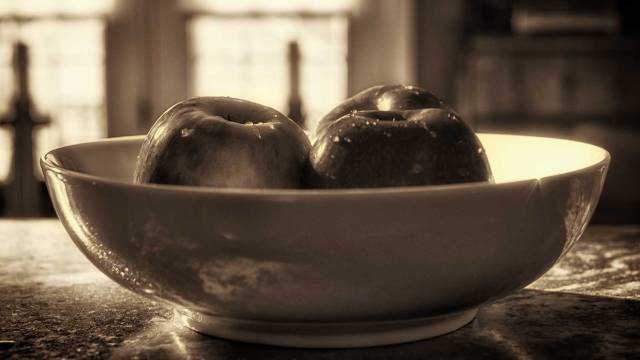
apples Nikon D750 f/4 0.1s 35mm (prime lens) 100 ISO
In the two images below, I can see in the color image how the contrast highlights the water drops…they seem to glisten within this backlit photograph. While the water drops within the monochrome image are not as noticeable, I like how the reflections of the countertop are reflected in the bowl. The tiny sunburst along the right edge of the bowl is visually interesting.

snow Nikon D750 f/5.6 1/125s 300 mm 100 ISO
While I like the warmth of the monochrome image of the apples, I couldn’t seem to create the same atmosphere with the snow photograph. It just may be incongruent to create a warm image of snow?
I prefer the color image which had a bit of editing within Color Effects Pro 4’s green-yellow color contrast presets. The water drop on the tip of the leaf also seems more apparent in the color image.

The low contrast monochrome image (first monochrome image) is not as dramatic as the high contrast (last image). The water drop also seems more apparent in the last image. I also noticed during the digital darkroom process that experimenting with contrast within Color Effects Pro 4 required awareness of how some of the presets darkened the leaves to a degree where the detail was hidden.


Again, thank you Raj for these lessons. I would also like to thank Helen at HHC Blog for bringing to mind the beauty of color contrast within images.

Thanks Brenda for another super post! I really like the comparison you do and the narration on them.
Set 1: You are right, the colour version really enhances the image. What could be the reason? Well, I think its because we all have seen the apples in colour, so our eyes recognise the apple in colour very easily. However, if your intention is to show the curves in this picture, you need to go for monochrome and you need to increase the contrast and the highlights, that would put the emphasis on the curves. It’s not that easy to do with the colour version.
Set 2: I agree with your assertion, but the main reason being, in black and white version there is less than required contrast. Again same as the first example the purpose of black and white and colour are totally different. Whenever you shoot for black and white, you have to do different types of tweets on contrasts, highlights and shadows.
This critique is part of XDrive’s Photography Learning sessions. Thanks for wonderful experimentation Branda.
Raj
For about a month I have been pondering the psychological influence within my experiments with street photography. My work seems to reflect…or evoke emotions more and less of a visual art form similar to photographer like Henri Cartier-Bresson
This iPad has a mind of its own this morning. I wonder if my work as a psychotherapist and studies of family dynamics has a similar dynamic as you noted about the apples? As a child I was often frustrated with my inability to draw random birds flying in the sky. Then I read that the brain seeks patterns. Then a clinical supervisor suggested that my brain may have been creating patterns. So…now I wonder if there is a similar brain functioning at play here. Sigh, I am never going to be a Cartier-Bresson.
That’s great Brenda, yes photography is like worship… you get connected with your subject, if you are able to convey the same relationship to your viewer, thats’ it, you have a great photo there!
I know that I was very limited in knowing my mother as a person who lived a varied life before she became a mother. It is as if somehow we know parents more than others and yet, still we know less about them than others. I would like to think my father would have responded to my question as you did with such validation. Your family is gifted.
That’s so generous of you to say that Brenda… I dont know how to respond to your message now. 🙂 But big thanks for you kind words!
Good morning, Brenda. Thanks for your kind words. Have I told you that I have learned a lot from you? (Can I email you? He he he)
Wow! I love your apple photo! Simple and beautiful. (I like your style and your camera, too. Ha. I really like my D750.) I can’t really figure out what was the cross like shadows in front of the window; it’s interesting.
I have a confession… I downloaded your B&W apple photo because I really really want to see it in higher contrast. (I only did this twice or three times in 6 years. And I deleted the photo afterward. I hope I didn’t upset you.) To my surprise, when I loaded it in PS, I love the photo much better that when I saw it on your post. I added a little contrast anyway, and when I compare the before and after, I love them both. (Now, I deleted your photo from my PC.) Why, I wondered. I think it is when you place the B&W right next to the color one, the B&W, somehow, lost part of its beauty. Not sure I am 100% right, but I found this exercise very interesting.
Have a wonderful day.
I am humbled. If my blog serves to “pay it forward” then maybe we are also teaching. Sharing is my primary motivation for blogging. I would enjoy seeing what you did. Can you pull them out of the trash and post them?
I didn’t do much, just increased the contrast a little bit (The first thought I had when I saw the photo was that it would look better with more contrast). I found out it didn’t need too much more… maybe it didn’t need any (as I explained on my original comment.) I have learned that where you see the photo may make a lot of difference. From time to time, same photo displayed inside of PS, outside PS but on my PC, on FB or WordPress… it looks somewhat different.
So the photo display is similar to how colors interact and change each other?
I don’t quite know the answer. ;-( I have been staring at your apples for a while. Ha ha. I think the B&W doesn’t look too interest right next to the color one for sure. Hmm… that means whoever stands next to me may make me look differently, too 😉 Not that matters…
Sorta like complementary and contrasting colors 😊
Playing with one of my photos, I suddenly realized that when I display a photo on my PC, the app will provide a black background and inside of PS, the background is light gray. No wonder they look different. 😉 The background of your blog is kind of in between color. I wonder if that have something to do with how your B&W photo looks too. Maybe it’s the contrast between the frame (background) can be increased. My 2 cents…
Interesting. The framed b&w images in my home all have pure white mats.
I forgot…the cross like shadows are candle sticks ☺️