
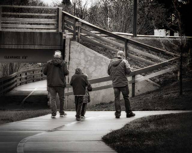
Old and tattered…yet, still catches sun rays. Jumping in Becky’s roof square challenge.
Old and tattered…yet, still catches sun rays. Jumping in Becky’s roof square challenge.
When the evening sun descends behind the mountain peak,
Will you forget that it is I who gazed with longing
Towards the place where you are?
~Sarashina Nikki (Diaries of Court Ladies of Old Japan)

Creativity is the ability to make or do something new…the ‘something’ can be an object, a skill, or an action. To be creative, the object, skill, or action cannot simply be bizarre or strange; it cannot be new without also being useful or valued, and not simply be the result of [an] accident. …an important form of creativity is creative thinking, the generation of ideas that are new as well as useful, productive, and appropriate. The second is that creative thinking can be stimulated by teachers’ efforts…
Ten images of a milk bottle.


This photo study of iPad images builds upon A Cemal Ekin’s, invitation to “look for texture, lines, shapes, and forms rather than ‘things'” with Ted Forbes’ photo assignment: variations video which discusses creative thinking as well as includes an exercise to create 10 images of one subject.
Thank you for visiting. I am looking forward to reading your thoughts about creativity and seeing your collection of images….let’s tag with #aphotostudy.
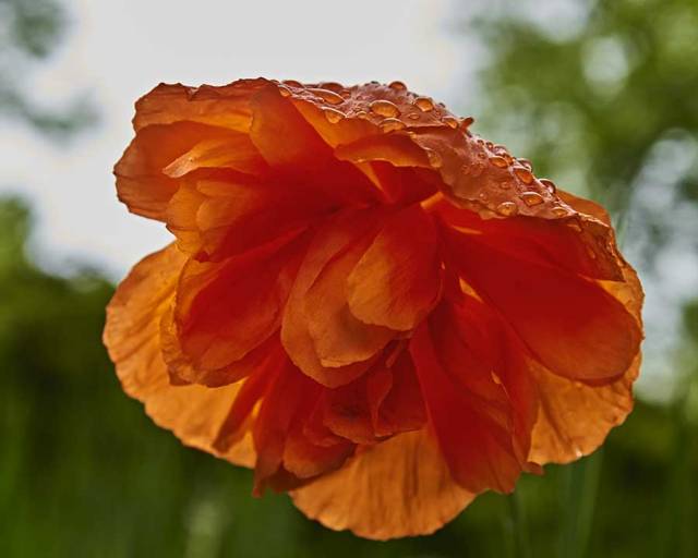
just being alive
I
and the poppy
~Issa (www.haikuguy.com)
“We tend to think of human beings as falling into two groups: those who are similar to us and those who are different. We allow political boundaries to obscure our interconnectedness. What we often refer to patriotism is actually a barrier the prevents us from seeing that we’re all children of the same mother. Every country calls its nation a motherland or a fatherland. Every country tries to show how it loves its mother. But in doing so, each country is contributing to the destruction of our larger mother, our collective mother, the Earth. In focusing our human-made boundaries, we forget that we are co-responsible for the whole planet. …
Nikon D750 f/4.5 1/200 85mm 100 ISO
“Every one of us, regardless of nationality or religious faith, can experience a feeling of admiration and love when we see the beauty of the Earth and the beauty of the cosmos. This feeling of love and admiration has the power to unite the citizens of the Earth and remove all separation and discrimination. Caring about the the environment is not an obligation, but a matter of personal and collective happiness and survival. We will survive and thrive together with our Mother Earth, or we will not survive at all.”
~Thích Nhát Hanh (Love Letter to the Earth)
Nikon D750 f/7.1 1/800 85mm 100 ISO
…Just as we are made of non-human elements and the flower is full of non-flower elements, the Earth is made of non-Earth elements. Like us, the Earth contains air, fire, and water, as well as the sun and particles from distant stars in faraway galaxies. In fact, we can se that the Earth is made exclusively of non-Earth elements. The whole cosmos has come together to produce the wonder that is this planet…
~Thich Nhát Hanh (Love Letter to the Earth)

Nikon D750 f/7.1 1/500 46mm 100 ISO
This week’s photo study has been inspired by A Cemal Ekin’s article, “Seeing is the Essence of Photography, And You Can Learn to Do It Better.”
Within this article, Ekin wrote, “Photography is an analytic art form. We aim our lenses to specific parts of the world around us to pick a frame because, in our analysis, that particular frame presents the photograph we wish to take. We can certainly raise the camera, lower the camera, rotate it, pitch it, yaw it, aim at a different part and end up photographing something different.
“Seeing is the essence of this process, it is the essence of photography. It is our ability to absorb what lies in our view, process that, and target the frame that is the most compelling; that is the analytical part. Seeing is a mental process, it starts with our eyes capturing some information from our surroundings but continues as a mental activity.
“It requires awareness; and awareness is a state of mind. There are many things in front of you now but you are not necessarily aware of all of them. For instance, you are reading this post on a screen, it feels normal to you. But, are you “aware” of the screen dimensions? Are you aware of the distance between the screen and your eyes?
…
“Seeing can be improved — you can actually work at it and start seeing things you did not notice before. It requires looking with intention and awareness and learning to appreciate many different things. The movement of the tree branches may create delightful patterns, flight path of a butterfly repeating itself, the huge scissors in front of a tailor shop mimicking the open legs of the pedestrians, there are many, many things to notice and see.
“The result is that you may actually start photographing things that you did not before, partly because you did not see them before and partly because you have come to appreciate them! Seeing is part of your experience, you should feel that you are seeing something as a result of your keen awareness, in that state of mind.
“Here is a simple exercise you can try. Take your camera, any camera and go down to your basement. If you don’t have a basement, go to your garage. If you don’t have a garage, go to your bedroom. You have 15 minutes to produce 30 photographs in that space with the following requirements:
“Try to focus on things that normally escape your attention, like the folds of the bedspreads (if you are in the bedroom), the way the stairs may be worn going down to the basement, the stains on the garage floor, etc., etc. Look for texture, lines, shapes, forms rather than “things” to photograph.


“You also need to limit your vision to the center square section of the viewfinder, this makes you truly aware of what is outside your frame, because you actually see them knowing that they will be cropped. Why are you leaving those things outside the frame? Why are you including the others you include within?
“Now look at the cropped images, they are probably not your typical photographs. Do you find any that you would like to share with friends? What appeals to your sensibilities in them? What about those that did not work? Why do they not work?”
Erkin ended his article with an introduction to Inge Druckrey: Teaching to See
To learn more about Cemal Erkin’s, visit his website https://www.keptlight.com
Would love to read your thoughts and see some of the images you created during Erkin’s 15 minute exercise. Thanks for taking the time to visit.

Nikon D750 f/7.1 1/500 85mm 100 ISO
Suddenly, from behind the rim of the moon, in long, slow-motion moments of immense majesty, there emerges a sparkling blue and white jewel, a light, delicate sky-blue sphere laced with slowly swirling veils of white, rising gradually like a small pearl in a thick sea of black mystery. It takes more than a moment to fully realize this is earth…home.
~Edgar Mitchell, Apollo 14 Astronaut (cited: Thich Nhát Hanh, Love Letter to the Earth)

After participating in the WordPress’ weekly photo challenge for around 8 years, there is a bit of sadness in learning that this week’s challenge is the last edition. Don’t know why this decision was made and so with a bit of confusion and resistance I wave farewell and say, “thank you, it has been great fun. If you wish to return, there is a welcome back, awaiting.”
All-Time Favorites
Watching the moon
at dawn,
solitary, mid-day,
I knew myself completely,
no part left out.
~Izumi Shikibu (J Hirshfield & M Aratani, The Ink Dark Moon)


You must be logged in to post a comment.