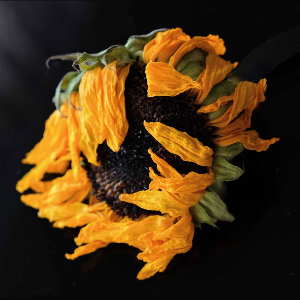
My eyes love the wet on wet water color blending of yellow ochre, red violet, and tea green.
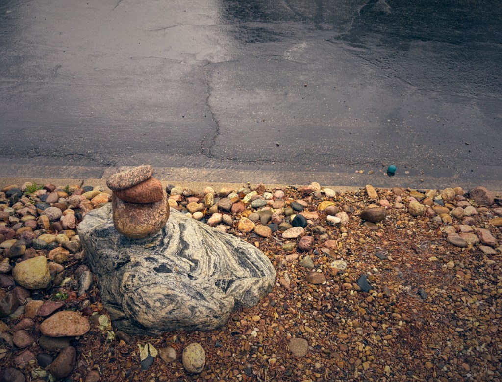
Ochre, a warm and earthy color, lies between yellow and brown on the color wheel. This clay-like hue suggests natural pigments and rustic tones, with shades like yellow ochre and brownish-yellow. It’s great for adding a grounded, timeless feel to designs, perfect for evoking a natural, inviting atmosphere.
But…yellow ochre seems to reach out and touch my soul…especially during the autumn.
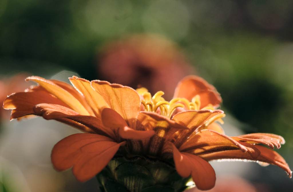
Red-violet is a vibrant, bold shade blending red and violet. Located between red and purple on the color wheel, it exudes energy and creativity.
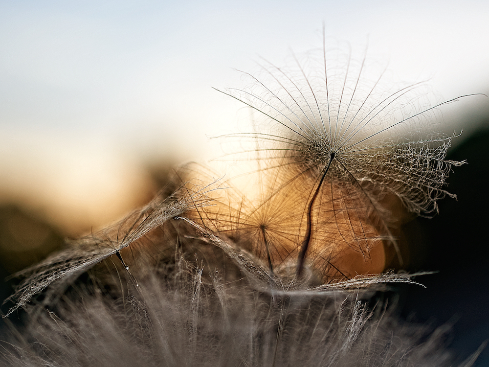


Tea Green is a light pastel shade of Green. It has high lightness and low saturation and is a pastel color. Tea Green is a warm color.

Unlike other bright or deep colors, ochre combines easily with a wide range of hues. It goes very well with neutral tones such as white, beige or light grey, but can also dialogue with more intense colors such as navy blue, olive green, or even accents of burgundy red for a bolder effect.
Hum…no mention of red violet or tea green…
Thank you Ritva for this lens-artists challenge.

Brenda, thanks for these beautiful photos and very informative post. The pastels are gorgeous.
Thank you … “gorgeous” brings a smile
Always the most beautiful photos, Brenda.
Thank you Lois
These are wonderful examples of shades I’d never have considered Brenda. I especially loved the left-most image in your middle set and all of the images in the last.
Thank you for your validating words
Wonderful and unique (again!) galleries, Brenda. Last one is simply wonderful.
Thank you Sofia
Different from most posts, but very informative and the images are so beautiful. Loved how you worded your like for Ochre, a warm and earthy color. Lovely post Brenda. PS. Found your post in the spam, so sorry for late response
Thank you Ritva. It’s nice to know I’ve been retrieved from a spam folder.
Your images are amazing. Thanks for describing each of these beautiful colors.
Thank you … “amazing” is nice to read
Brenda, I love your take on the challenge, a welcome tweak!
Thank you, heaps!