orignial raw image
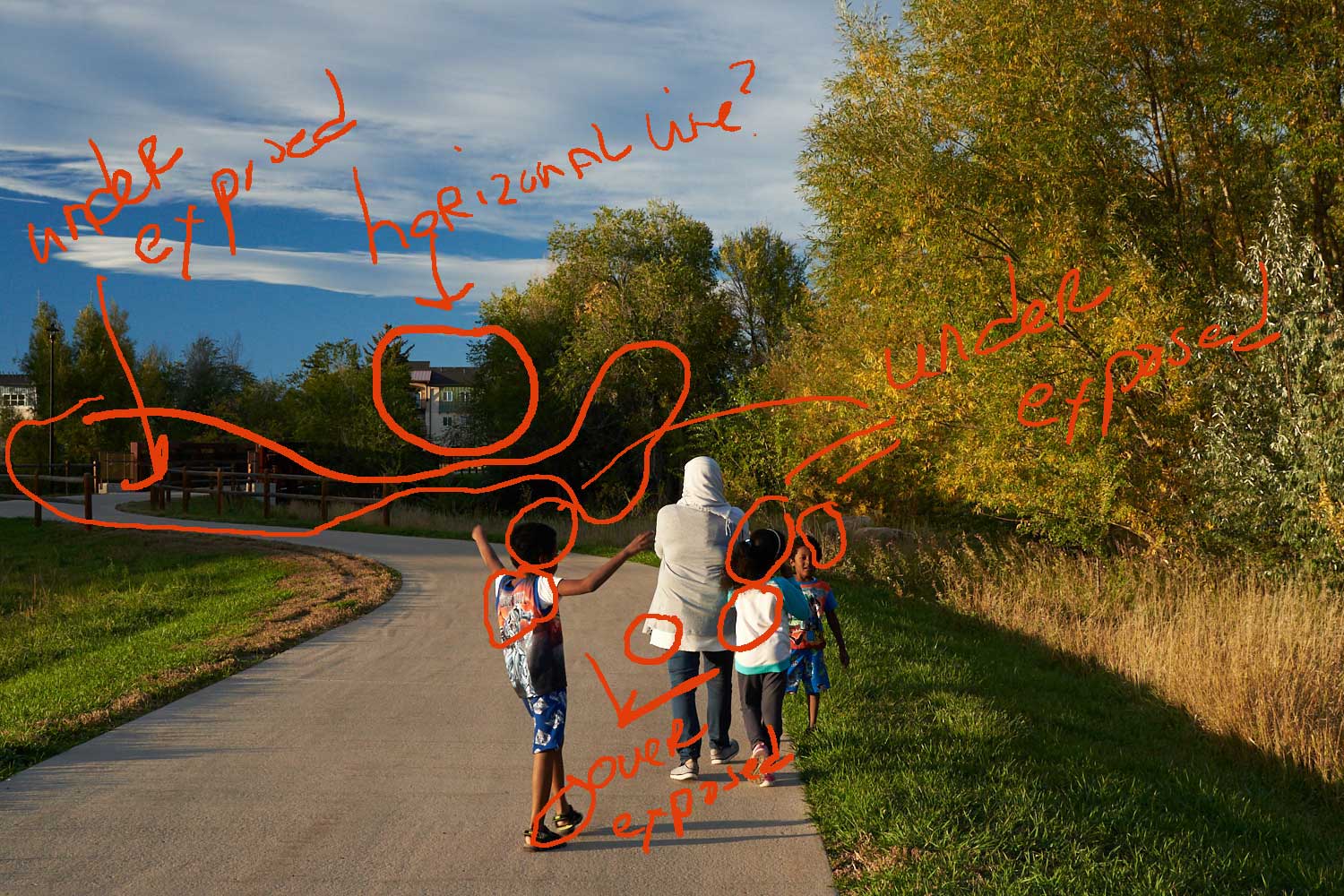
Raj’s xdrive photography lesson lesson for November explored 10 edits that photographers should know about prior to publishing images. My initial submission was of a family walking on a bike path during the golden hour.

Nikon D750 f/7.1 1/160 s 35 mm 400 ISO
Taking a few minutes to review this image in response to Raj’s feedback, I found that it is a bit of a challenge for me to notice the tilting due to 1) the curvature of the pathway as it moves my eyes to the background and 2) the presence of the trees hinders a clear view of the horizon.
In the markup below, my initial horizontal adjustment was the rooftop of the building in the background. Raj noted in his feedback, “we can’t rely on anything man-made as it all depends on the orientation of these things.” The areas I have circled were noted as over and underexposed by Capture One’s high exposure warning.
raw image with markup
adjusted image

first edited image with markup
Raj noted that the image stilled seemed a bit tilted in the image above. He also noted that the edited image is “kind of overexposed” and recommended that I “carefully check woman’s jacket, it looks kind of overexposed.” Also my editing seemed need a bit more saturation.
The image below was cropped with Raj’s recommendation in mind and I find it to be more focused upon the family dynamics. It also brings attention to Raj’s observation regarding the closeness of mother and daughter in comparison to the actions of the two boys. I also did not attempt to lighten the shadow element of the boys as I wanted the image to be about the family.
While the image below seems to address the overexposure Raj noted in the above image, I’m still struggling with this as the histogram (within both Capture One and Photoshop) as well as the Capture One exposure warning does not indicate an overexposure. So do I rely too much on technological guidelines over my vision?
It took me several tries to address the titling…sigh…
In regards to saturation, could the specifications of computer design as well as color calibration variances result in visual differences between what I see–or think I see–on my computer and what other bloggers see? If so, is there a way to address this? Also, I found that I needed to be very careful in regards to saturation as the image tended towards having a yellowish sheen.
All in all I the second edit does seem to be better.

second edit
monochrome images

first monochrome image with markup
When I compare the above initial monochrome image with the one below, I’m able to more easily see areas that may be a bit overexposed. The woman’s jacket has a burned appearance. The detail in the woman’s jacket below offers a bit of resolution to my question above regarding overexposure…it’s about the detail in the woman’s jacket and the girl’s top.
Since the young boy looking towards the camera suggests a message of interaction, I find that I prefer the lightening in the above image when compared to the one below.

second edit
Again, I wish to express my gratitude to Raj and to all those wonderful bloggers who stop by and visit.


 On the left side is a stationery box filled with certificates of marriage, birth, baptism, and death intermingled with a child’s brilliantly colored drawings.
 days,” my questioning mind wonders, “how many days were left before the decline of my father’s health shifted the lights of a colorful present into the gray-shaded time of waiting?” Within this stillness of waiting, memory tells of a young child seeking solace through repetitive rocking behaviors and of a father’s fragile heart enduring a turbulent wait for a donated aorta.
 awakens as the image of grief’s blackened shadow looms over me with its death-filled abyss of intermingled condemnation, uncertainty, and emptiness. I feel the void that will consume me if I were to release the eternal care of my son to its embrace. I come to know that I hold no trust that within death is compassionate loving-kindness. Awareness arises to tell me that as I run from grief with the anguish of powerlessness to protect the heart of my soul, like an addict running from her addiction, grief becomes even more insidious. In this undifferentiated chaos of anguish, fear, and mistrust there is hope [larger than a mustard seed] which seeks for the magical garment when donned will transform me into the Great Mother. It is childhood faith that clings to the belief that as God witnesses this transformation, absolution and reconciliation would simultaneously subdue this impenetrable monster and return my son, whole with the spirit of life, to…*


You must be logged in to post a comment.