I have very elementary understanding of color theory so if you find that there is an error within this post or a particular point needs additional clarification, I would appreciate hearing from you in the comments section. I appreciate any positive critique that assists with this year-long learning project.
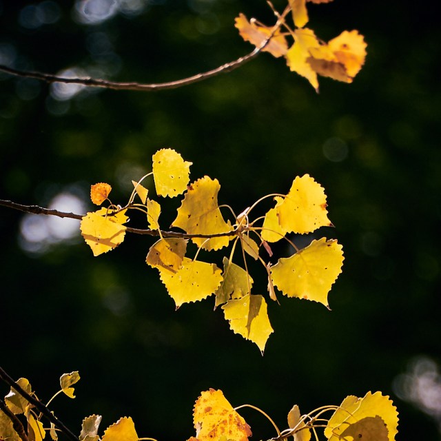
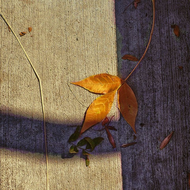
Color is light, and light is composed of many colors—the reds, oranges, greens, blues, and violets create the visual spectrum the human eye is able to see. The objects in our world absorb certain wavelengths while reflecting other colors; for example, we see the leaves on trees as green because that is the wavelength that is being reflected by the tree’s leaves.

The color wheel is a chart representing the relationships between colors. The colors include:
Primary Colors: Red, yellow, and blue are the basic colors and cannot be made from mixing other colors.
Secondary Colors: Orange, green, and violent – each of these colors are created by mixing two primary colors.
Tertiary Colors: There are six tertiary colors, each made by mixing one primary color with an adjacent secondary color.
On the Pocket Color Wheel, for Amateur and Professional Use one will read that color is described by three characteristics: hue, value, and intensity.
Hue is the name of a particular color.
Value is the relative lightness or darkness of a color (refer to gray scale). To increase contrast in your color scheme, you can adjust the value of a specific color; for example, making a yellow darker or lighter.
Intensity (Chroma, Saturation) is the purity of a color which determines its relative brightness or dullness.

Saturated Primary Colors red, yellow, and blue
- Chroma: how pure a hue is in relation to gray.
- Saturation: the degree of purity of a hue. A contrast of saturation is created by the juxtaposition of light and dark values and their relative saturation.
- Intensity: the brightness of a hue. One may change the intensity by adding white or black.
- Luminance/Value: a measure of the amount of light reflected from a hue. Those hues with a high content of white have a higher luminance or value.


Shade and tint are terms that refer to a variation of a hue.
- Tint: Color plus white.
- Tone: Color plus gray.
- Shade: Color plus black.
Neutral Gray is a balanced combination of white and black.
Warm (Advancing) Colors: Reds, oranges, and yellows.
Cool (Receding) Colors: Greens, blues, and violets.
Monochromatic is the use of any tint, tone or shade of just one color. These color schemes can be subtle and sophisticated and the contrast within these image is formed by the juxtaposition of light and dark values.

Using a color wheel divided into various shades and tints is one method of identifying possible options for color schemes. By varying the saturation and experimenting with shades and tints within the hue relationship, you can achieve quite a variety of palette options. Color combinations may pass unnoticed when pleasing, yet offend dramatically when compositions seem to clash.
Analogous: Using colors that are adjacent to each other on the Color Wheel. Use at least two colors but no more than five consecutive colors on the wheel.
Complementary: Using any two colors directly opposite each other on the wheel. Complementary colors bring out the best in each other and fully saturated colors offer the highest level of contrast. When one choses from tints o shades within the hue family the over contrast is reduced.
Split Complementary: Using any color with the two colors of each side its complement.
Triad: Using three colors equally spaced from each other on the wheel.
Tetrad: using a combination of four colors on the wheel that are two sets of complements.
Key Color: Predominant color in the color scheme of a painting or other creative project. Color is very psychological and different color harmonies produce different effects. For example, because analogous colors are similar in hue they will create a smooth transition from one color to the next.
When we are working on a computer, the RBG colors we see on the screen are created by combining the light from three colors (red, blue, and green). The complementary primary-secondary combinations are red-cyan, green-magenta, and blue-yellow. Black is [0,0,0], and White is [255, 255, 255]; Gray is any [x,x,x] where all the numbers are the same. The max value of each of the colors is 255.
How do you use color in your images? Do you find that your creative work tends toward back and white, monochrome, or color? Do you have a favorite photographer who works with color?
I am looking forward to any images you would like to share and your thoughts about the use of color in photography. Let’s tag with #aphotostudy.


You must be logged in to post a comment.